Video Style and Branding
Videos are an important medium for telling the Smith School of Business story. Videos produced by any individual or group at Smith School of Business (or externallly) should be of the highest quality to properly represent the organization and its identity.
Video Style Guide (196 KB)Logo Usage

Box Logo
For videos, the Smith logo typlically appears in a Smith Blue box or the reverse version, depending on the placement.
Download box logos
Vertical Logo
When placed over a background image that is simple and clean enough, the Smith logo may be used without a box.
Download vertical logosLogo Animation Resources
Transitions that wipe or reveal via masking are preferred in most cases. Motion blur is generally not used. Exceptions apply in 3D animation when appropriate.
We have prepared a couple of logo animation references. This animated Smith box logo intro/outro can be used at the beginning or end of a video. When used at the end, the logo rotation typically transistions into a url or call-to-action.
Here's another example of a logo animation for Smith Business Insight
Colour & Typography

Typography
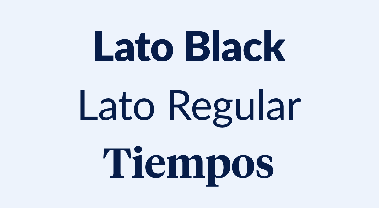
To ensure correct typography in video applications, please see the typography guidelines.
Typography guidelinesTitles and Lower Thirds
Company Name
Smith School of Business
White text in a Smith Blue box for titles for clear legibility on any background image. Animate box in frame via a mask separately from text.
