Permission is required for the use of any Smith School of Business family of logos, trademarks, brand assets, or likenesses.
Smith Colours
There are a number of carefully curated colours as part of the Smith Business visual identity. The primary colours are used regularly and often. The bright secondary colour palette is used to create visual interest. The tertiary colours are used sparingly as accents only.
Primary Colours
PMS 2768 C
CMYK 100, 90, 13, 71
RGB 7, 29, 73
HEX #071D49
PMS 2728 C
CMYK 95, 75, 0, 0
RGB 0, 71, 187
HEX #0047BB
Secondary Colours
CMYK 60, 5, 0, 0
RGB 0, 193, 255
HEX #00C1FF
CMYK 85, 40, 15, 0
RGB 11, 118, 166
HEX #0B76A6
CMYK 50, 0, 30, 0
RGB 94, 207, 191
HEX #5ECFBF
CMYK 85, 20, 40, 5
RGB 0, 131, 138
HEX #00838A
CMYK 0, 85, 55, 0
RGB 255, 94, 110
HEX #FF5E6E
CMYK 20, 100, 50, 0
RGB 200, 33, 93
HEX #C8215D
CMYK 40, 59, 0, 0
RGB 182, 144, 244
HEX #B690F4
CMYK 90, 100, 0, 0
RGB 71, 47, 146
HEX #472F92
Tertiary Colours
CMYK 50, 10, 100, 0
RGB 154, 203, 62
HEX #9ACB3E
CMYK 33, 0, 100, 40
RGB 87, 129, 0
HEX #578100
CMYK 5, 40, 90, 0
RGB 255, 165, 0
HEX #FFA500
CMYK 0, 60, 100, 20
RGB 189, 90, 0
HEX #BD5A00
Program Specific
The Bachelor of Commerce program has a specific burgundy colour.
CMYK 20, 100, 70, 30
RGB 132, 41, 60
HEX #84293C
Colour Application
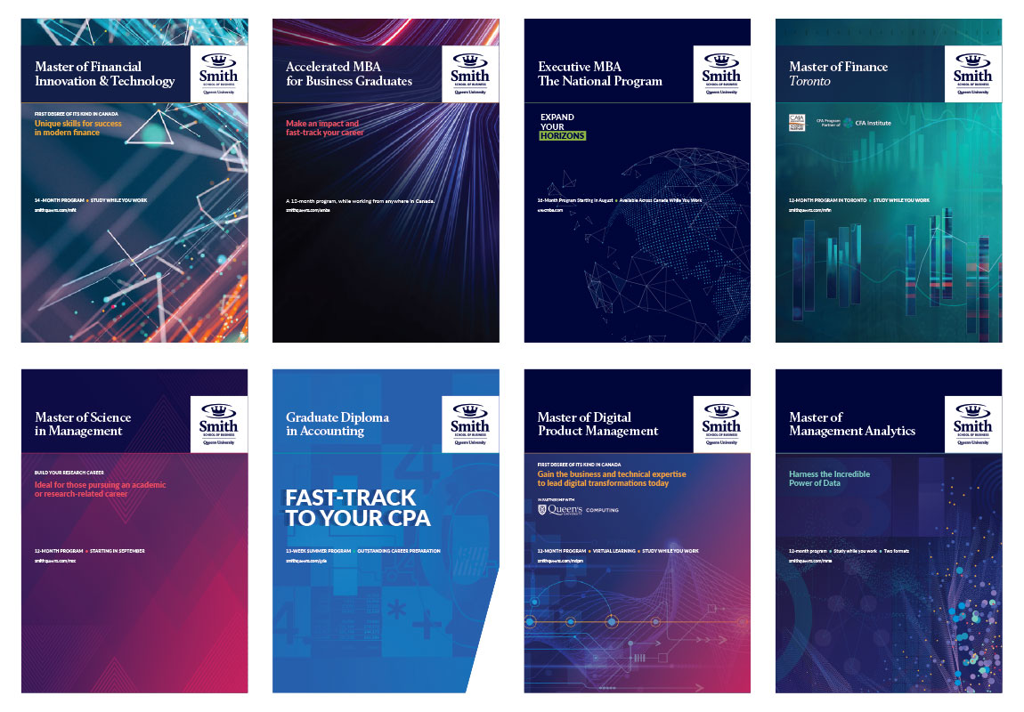
Here are some examples of the Smith colour palette in use across various programs.
Accessible Colour Contrast
Contrast between text and its background colour is vital to ensure readability, especially for people with moderately low vision.
These examples were tested using a colour contrast checker and align with the Accessibility for Ontarians with Disabilities Act (AODA) contrast ratio requirements as per the Web Content Accessibility Guidelines (WCAG).
All other colour combinations used should be tested with a colour contrast checker, in compliance with AA or AAA WCAG standards.
For additional information, visit the Queen’s Accessibility Hub.
WCAG Levels
AA
- Text should have a contrast value of 4.5 or higher
- Large text should have a contrast value of 3 or higher
AAA
- Text should have a contrast value of 7 or higher
- Large text should have a contrast value of 4.5 or higher
Font Size Definitions
Text
- Less than 18pt/24px for regular fonts
- Less than 14pt/18.5px for bold fonts
Large text
- 18pt/24px and up for regular fonts
- 14pt/18.5px and up for bold fonts
AA & AAA compliant colours for text & large text
Below is a list of text colours on their suitable backgrounds (light or dark) with their corresponding contrast values. These colours are carefully chosen for readability and meet or exceed AA ratings.