Permission is required for the use of any Smith School of Business family of logos, trademarks, brand assets, or likenesses.
Typography
Consistent application of typography is required to maintain the Smith Business brand design style. There are three official fonts. Guidance on when and how to use these fonts is provided on subsequent pages.
Fonts

Lato is our primary font. Lato Black is used for titles, headings, and URLs. Lato Regular is used for body copy in print and web.

Calluna Bold is a specialty font used sparingly for the Smith name in official logos, along with program names in logo lockups.

Tiempos is a specialty font used solely for editorial publications, print and digital, including Smith Business Magazine and Smith Business Insight. It is not to be used outside of these publications.
Lato
Lato is our sans serif brand font and has been adapted for legibility in digital applications. Lato is the primary title font for designed applications, like brochures and advertising. It is also recommended for headings, subheadings, intro paragraphs, quotes, and URLs in those applications.
While Lato works very well in all caps, capitalization should only be used for purposeful differentiation or emphasis to retain maximum accessibility. Avoid using all caps for any text longer than a few words.
Black weight should only be used for small amounts of text, like titles and headings, and at a larger size.
Staff/Faculty: If you do not have Lato font installed on your school-supplied computer, please contact Smith IT.

Calluna Bold
Calluna Bold is a specialty font used sparingly for the Smith name in official logos, along with program names in logo lockups.
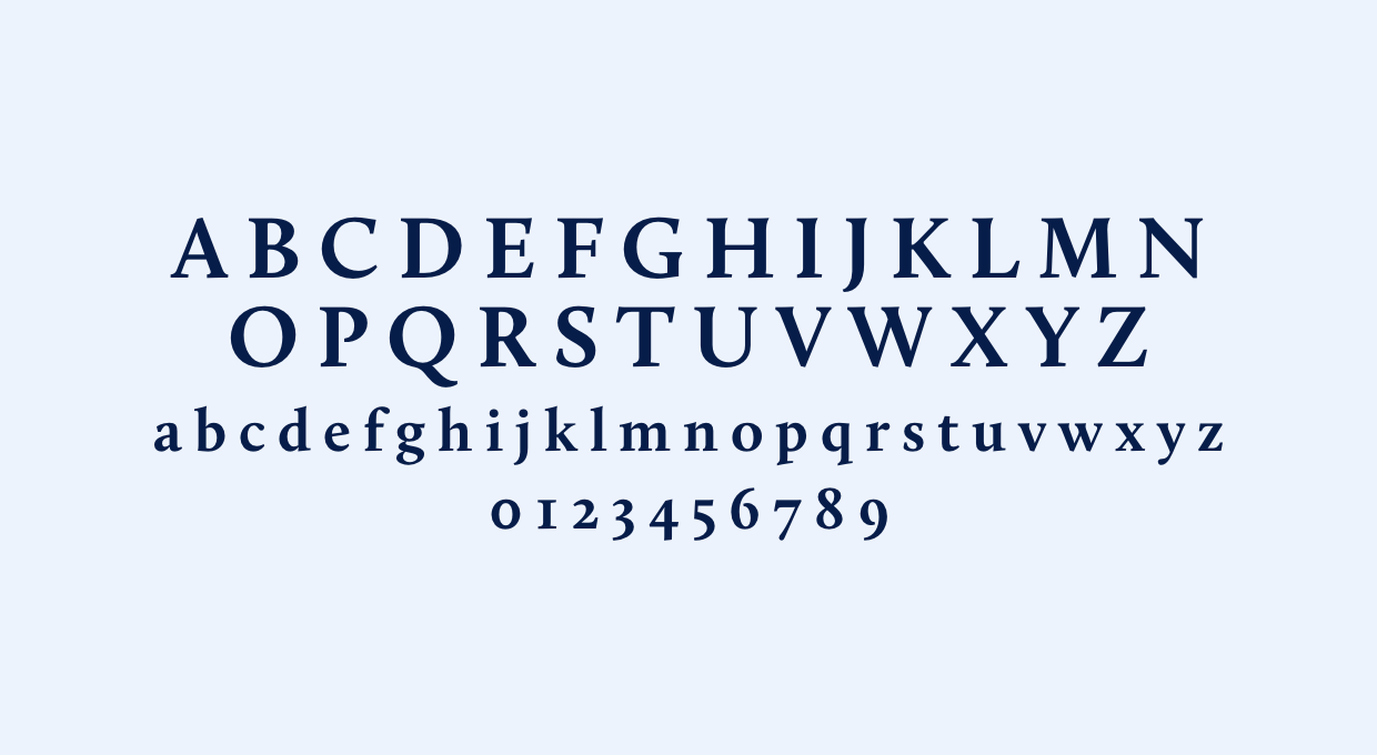
Tiempos
Tiempos is a serif font family used for Smith’s editorial publications solely. There are a number of font variations in this set, for visual interest and readability.

Font Use
Effective typography that integrates contrasting weights and textures creates interest and helps readers navigate the material. The example at right illustrates this approach for print applications.
This hierarchy is for reference and can be altered to suit specific applications.
For additional guidance on typography, review the Design Style section of the guide.
Title and Heading Case
Short titles, headings, and subheadings are best set in title case (see heading example).
Long editorial titles, headings, and subheadings are best set in sentence case (see subheading example).
Minimum Type Size
To maximize legibility in print applications, the recommended minimum point size for body copy is 10 pt.
Body copy example. Puda solorro cuptatis autemo officiaeces ad militatem etur re corumqui blam aliquia eprese acereratur, optaten iatem. Id qui dunt reres in ped et qui vel is rerenda net quate autas aut veriti as veliquatem eos dem ipidest repelecto dolore licienimo odipsunti rehendi nulluptia doloreh endanient vid et aut aribus.
Simaio millor rem ut quam imenis quis que eostis alibusande est esciisimin providit facepudit quam asperum rero esecabor si assi omnis mi, ut inctor sequi ium quiae conserchit quia dollati beriorrum earum laboribus.
Unsure about typography?
If you are uncertain about the use of any of the Smith Business fonts, check with Smith Marketing & Communications.