Are Bad Visuals Holding You Back?
Pretty presentations, clear charts and functional figures aren’t just matters of esthetic preference. They can impact your work
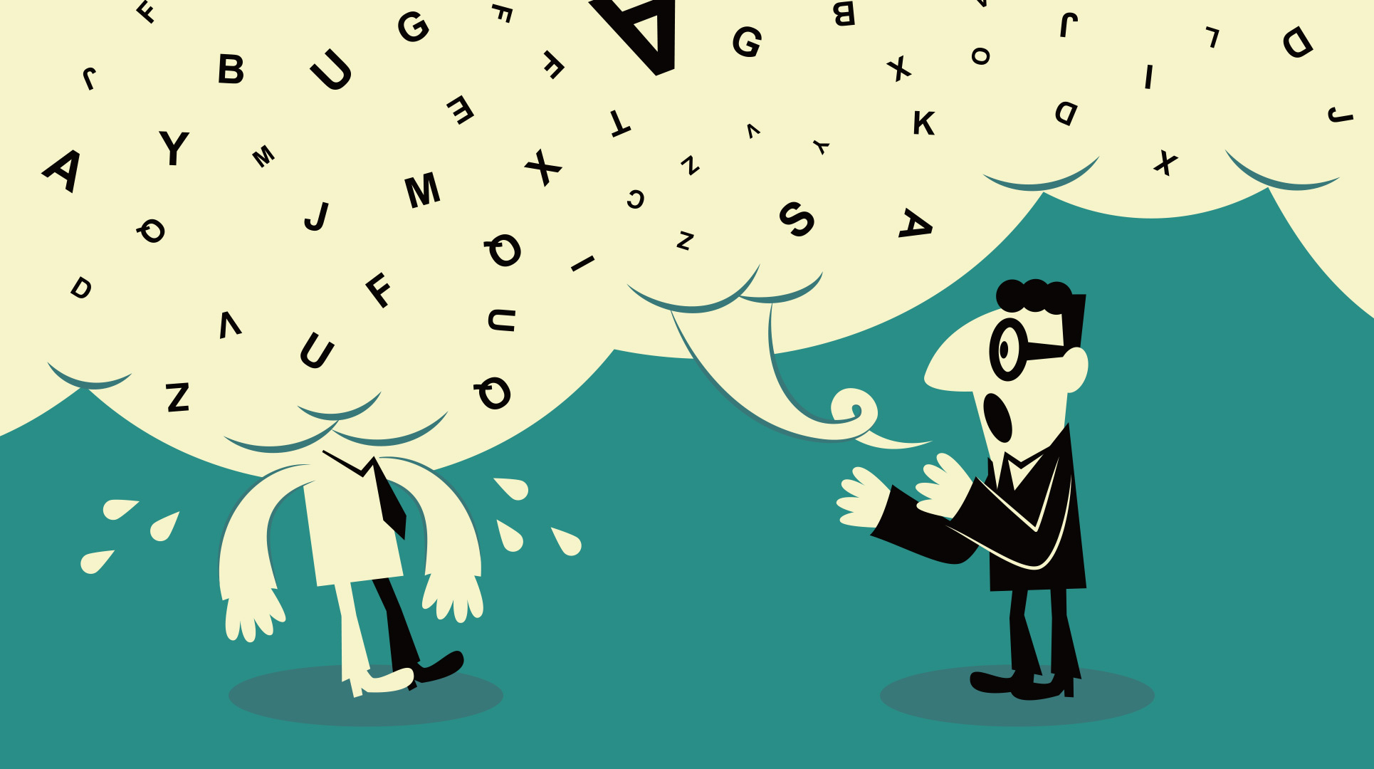
Like a lot of us, Shiz Aoki has experienced her share of bad visuals. She’s seen big, bold ideas lose oomph due to cluttered charts. She’s seen brilliant minds lose credibility because of slapdash slide decks. She’s seen scientific breakthroughs rendered unintelligible by muddled graphics. She knows, better than most, that what audiences see affects how they react — and that most busy people need help creating accurate and effective visuals. “I realized this is such a huge problem,” Aoki says.
Aoki, a Queen’s University graduate, is the CEO and co-founder (with fellow Queen’s grad Ryan Marien and Katya Shteyn) of BioRender. This Toronto-headquartered startup is quickly changing the way scientists communicate visually. BioRender operates a web-based design tool that allows scientists to develop polished and accurate figures, graphs and other forms of data visualization simply and intuitively. Think of it as a Canva or Figma for folks who live in the lab. Since its launch nearly seven years ago, the company has become one of the country’s buzziest businesses: in 2018, it graduated from the prestigious Silicon Valley accelerator program Y Combinator; in 2023, it landed 17th on the Globe and Mail’s annual ranking of Canada’s Top Growing Companies.
Aoki brings a unique, and specific, perspective to how visuals are communicated in presentations and beyond. A lifelong interest in both medicine and visual art led her to concurrently pursue Bachelor of Science (in life science) and Bachelor of Fine Arts (in painting) degrees at Queen’s, before earning a master’s degree from the renowned medical and biological illustration program at the Johns Hopkins University School of Medicine.
Her deep knowledge of the medical illustration space positioned her to both identify a clear market opportunity (a lack of user-friendly tools to create effective scientific graphics) and to lead the development of a better mousetrap in BioRender. “If you’re going to make a difference in a space or for a group of people, you really, really have to understand the problem,” she explains. “There can be a lot of layers to that, and we obsess over all of them. I think that’s what makes the tool feel so easy to use, like something that’s been here the whole time.”

In Aoki’s view, good visuals are about a lot more than esthetics: Clean and clear graphics, charts, decks and more can make a material difference in educating, persuading and motivating audiences, whether you’re in a bio lab or a boardroom. Here, Aoki explains the problems that can arise from bad visuals — and the benefits that can come from investing in good ones.
Good visuals make your message easier to understand
Most of us have been there: You’re at a conference, and the speaker clicks through to a slide with a crowded, complicated, convoluted graph. You immediately tune her out as you try to make sense of what you’re seeing. Then, before you can register the logic behind the image — much less what you’re supposed to do with it — she moves on to the next, leaving you disoriented, confused and no more educated about the matter at hand than you were when she took to the dais.
Aoki believes that audiences should not have to strain to understand the imagery in front of them. “Less is often more,” she says. Consistent, logical and uncluttered imagery serves as a sort of shortcut for brains to take in big ideas — ultimately making the delivery much more effective. “When you have great visual communication, it aligns everybody in the room in a meeting so much faster,” Aoki says. “It brings people up to speed to the story you’re trying to get across, and that is so valuable.”
Good visuals build trust
Pretend you’re in the market to switch banks. You’re evaluating two options. Bank One has a website that looks clean and professional, with colours and fonts that match what you see when you walk into a branch. Bank Two’s site has dated photos, a jumbled user interface, and looks like something your cousin might have dashed off in 2004. Which feels like a safer place for your money?
Again, this is not simply a matter of superficial or decorative preference, as veteran Silicon Valley product designer Margaret Gould Stewart articulated in an influential 2015 essay. “If products look ‘janky’ — our industry’s favourite term for poorly crafted — then perhaps our customers might start doubting the validity of our data or the reliability of our back-end systems,” wrote Gould Stewart. “We want the craft of what we do to reinforce a sense of quality; that the product is well made, is reliable, and can be trusted.”
Aoki believes this is as true in science as it is in business. When things look sloppy or unclear, she says, audiences start to question the degree of care applied elsewhere: “There are a lot of repercussions,” she says. Might a brand that doesn’t care about a harmonious online presence skip due diligence? Might a prospective hire with a rough-and-ready trial presentation struggle to represent the company professionally? It takes very little time to plant a seed of doubt. “Things have to look professional for audiences to feel trust,” Aoki explains. “Mistrust starts when things look intimidating or hard to understand visually.”
Good visuals influence business outcomes
Imagine a meeting to decide whether to invest in a new technology. The presenter circulates a diagram to represent how it works. One attendee has a question about the icons used. Another can’t tell which colour represents what. A third can’t read overlapping labels. No one is quite sure what Fig. A is supposed to mean, and no one can make out what Fig. B is supposed to depict at all. Before you know it, two-thirds of the meeting has been chewed up in explanations and justifications that wouldn’t be needed had the design been better attended to.
“When you do things like standardize fonts or imagery, it creates a shared grammar or language that helps people quickly pick up what a figure symbolizes,” Aoki explains. “And that allows audience attention to move towards understanding the concepts.” In a world in which time is money, this can make the difference in green-lighting proposals, publishing papers, securing funding and locking down deals.
“Poor visual communication might seem a few degrees removed from things like that, but it can quite directly impact the outcomes of important work,” Aoki says. “So much depends on getting the right buy-in at the right time. That’s true in science, and it’s true in business, too.”